SBSettings Theme Creation
Author: BigBossThe default SBSettings theme with all theming elements included in this page is located on your iPhone after installing sbsettings at /var/mobile/Library/SBSettings/Themes/Default.
This guide describes all the themeable elements of the SBSettings app for v1.0. My goal is to keep this interface locked down from this point forward so that themers do not need to retheme for each new elements. While there will be new toggles in the future, there is also a blank strategy that will be described below to match up a glyph with a blank provided by the theme in the event that the theme does not provide the themed images for a specific toggle.
Themes are applied within the app now. The themes should never overwrite files that ship with the app. Instead, you should follow this guide and file locations and allow your theme to be selected in the app’s theme manager window.
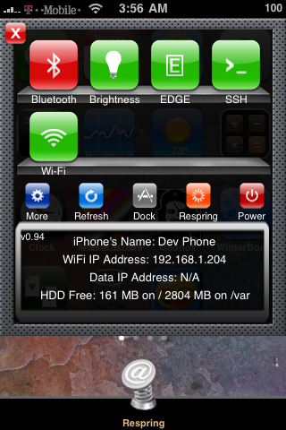
Here is a screenshot of the finished SBSettings with default theme:

Location:
All themes go in /var/mobile/Library/SBSettings/Themes folder. A folder is made with the name of the theme and the images are placed in that folder. The default theme is given as a sample of how this works. Remember that files are all case sensitive. This means on.PNG is not the same as on.png. EDGE folder is not the same as edge folder or Edge folder.
Files:
Toggles: Each toggle folder must have an on.png and off.png to represent the main graphic toggles for the theme. Each toggle button is 60×60.
The Main Window: The main window can be one of 3 sizes depending on the number of toggles available. The files used are BackgroundImage1Row.png (320×287), BackgroundImage2Row.png (320×375), and BackgroundImage3Row.png (320×480). Note that the image will be layed at 0,0 over the statusbar so take this into consideration when you make your images. The default images leave transparent space at the top for the statusbar.
Buttons: There are now 5 small buttons (dock is the newest one). These 5 buttons provide static functionality such as “more”, “respring”, “refresh”, “power”, and “dock”. The buttons are 30×30 png files. The filenames required are: Power.png, Refresh.png, Respring.png, Settings.png (more button), Dock.png. In addition, “more” and “dock” have times that they cannot be used. Therefore there are also two more buttons: “DockNoUse.png” and “SettingsNoUse.png“. On the stock theme, these just have a red no use circle around them. There is also a “NoUse.png” file for future buttons that may have to be turned off.
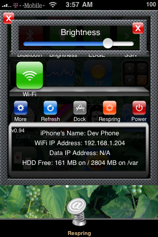
Window Frames: There are 3 window frames used for slide in windows of varying sizes. This is used for the dock and brightness control. The filenames for these are: SliderFrame.png (271×71), SliderFrame2Row.png (271×121), SliderFrame3Row.png (271×171).


Blanks: Each theme must implement a blank on and off png icon. These must have the name: blankon.png, blankoff.png. In the event that a new toggle comes out and your theme does not support the new toggle yet, the toggle’s glyph will be used with the blank to attempt to build a themed toggle. I realize this isn’t perfect and won’t even work well for some themes, but it’s the best I could come up with. Of course you can always update your theme to support new toggles so that they look perfect. The blanks should be 60×60 just like the toggle buttons.
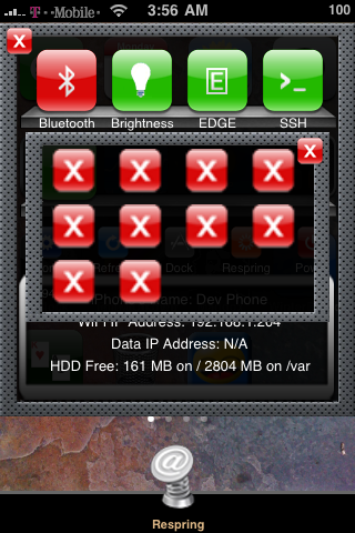
Close Button: The Close.png button will be used on all windows and slider windows to close them. These are 25×25 pixels.
Theme Submittal: Of course your theme is yours to share or keep to yourself. However, if you would like to submit your theme for hosting and distribution, please use this link.


